I delivered this first presentation in October 2014. In retrospect, I realise that a lot of the ideas and briefs that I wrote weren't really in any firm direction, or at least not in the direction that I actually intend to pursue after university. Reflecting on how I felt at the start of the year, I think I was still very much in 'holiday mode'. After having such a blast in the summer working abroad, and having made no focussed graphic design development over summer (just made connections etc) (I didn't realise it at the time) but I wrote all of my briefs based on things I already knew how to do, that I knew I could do well, like packaging. Truth is, my chosen career path of themed entertainment design doesn't encompass packaging so much as signage and lettering.
In my new presentation, I realised that my career has been taken in a different direction and started by re-evaluating how I was presented through my manifesto. It's taken me from February since October to realise what I was doing wrong, and so you can see my portfolio has suffered. I feel like I've lost a lot of time, and that my portfolio is weak. I have applied to internships for after university at Disney in FL, but feel like I don't deserve it because I don't feel proud of my portfolio and I know I can do better. I have applied to lots of different places because I want to gain experience and prove how good I really am. I was disappointed with my dissertation mark because although I am not necessarily a grade-chaser, it was saddening that even when I tried my very hardest, my hardest was only 'average' on paper. I heavily let myself down with the practical element of the dissertation, because I procrastinated too much, worrying that I couldn't make it as perfect as I had determined in my mind. But, on a positive note, I have written and planned out my last few months at uni and planned on how to make my portfolio perfect. The pressure is now on to perfect it and keep spreading myself around and hopefully get a job in my dream career sector. I have had a hiccup because I lost my direction for a moment, but now I have my eyes on the prize!!
Showing posts with label ppp. Show all posts
Showing posts with label ppp. Show all posts
Thursday, 19 February 2015
Tuesday, 18 November 2014
OUGD602 - PPP3 - Type Motion Event Liverpool
Today I visited a gallery in FACT Liverpool to the Type Motion exhibition.
The gallery exhibited over 200 films that showed type in motion such as title sequences, colour tests and kinetic typography art.
Honestly, I found the exhibition content to be fairly stuffy, but the way it was presented was really interesting. I found Gallery 2 the most creative: one part allowed the user to create their own playlists of films using a touch screen system not designed in a grid like format, but radial, like a wheel.
The other was an interactive video using a Leap Motion system. I really wish I could do something like that for my final exhibition, though it's quite far fetched, I may punch in a google search or two to find out how it's done. It's something that could be used in museums and theme parks, and is fun to engage with.
I managed to find a video of the exhibition so you can get a better look at what I was talking about:
***
OK, Google search punched - this Leap Motion system really does have a lot of potential. I'm really interested in the Themed Entertainment sector, which concerns design through storytelling and experiences of the user, so something like this would be really good for my final show:
The video is really interesting, I get the impression that this isn't something that could replace the mouse or the trackpad currently, and there are many 1-star reviews on amazon at the moment:
http://www.amazon.co.uk/product-reviews/B00C66Z9ZC/ref=cm_cr_dp_hist_one?ie=UTF8&filterBy=addOneStar&showViewpoints=0
...suggesting the product is still in it's infancy. It would be great to have something like this for my final show, but not sure if I'm willing to spend the money on it just yet ... further investigation is required I think.
OUGD602 - PPP3 - Creative Networks Lecture
Last Thursday I attended the Creative Networks lecture held in Leeds College of Art. Although it was wholly an exhibition of illustrators and not graphic designers, it was really fascinating to me, as illustration has always been an interest of mine.
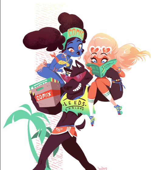
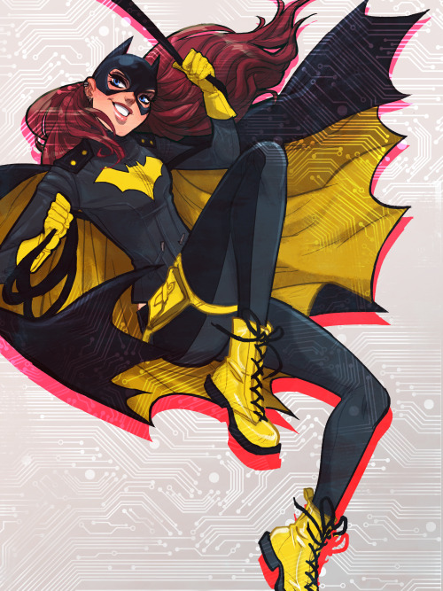
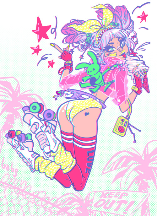
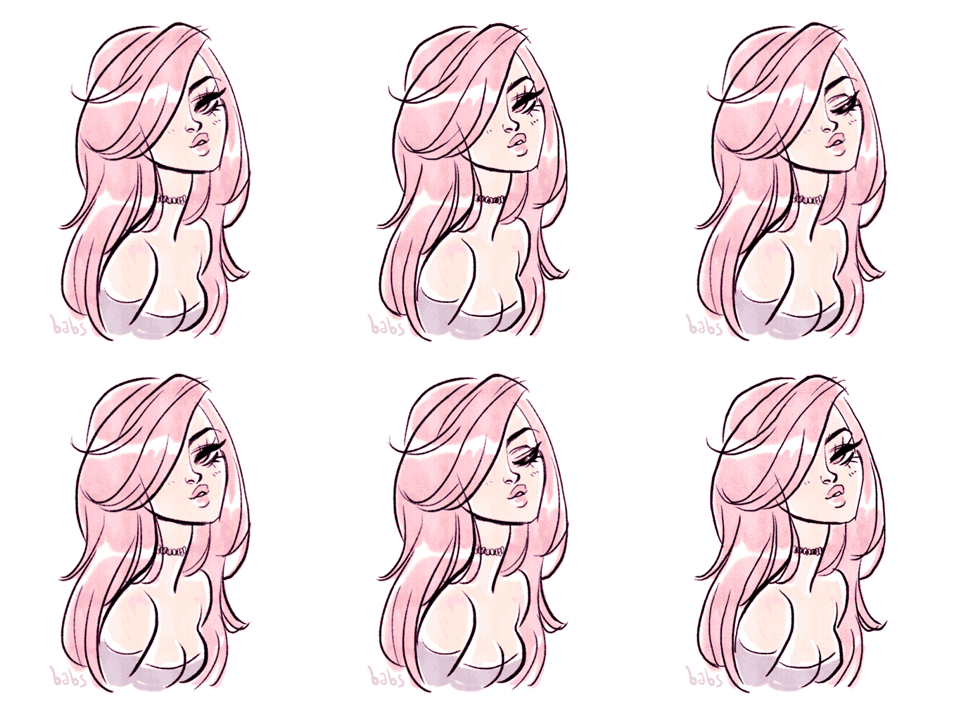
Babs Tarr gave an insight into her practices and she's simply amazing - she can achieve almost any style and covers a lot of bases meaning she's really flexible in her work. The amount of work she produces as well is astounding, and really inspired me to churn out loads of work, if I'm honest!
It turns out that I already follow Babs on Twitter, but I also proceeded to follow both Cameron Stewart and Matt Forsythe too. I managed to get a mini Batgirl drawing from Babs, I admire her a lot!
I'm really inspired to pursue illustration a bit more, it's always something I've wanted to do.
Some of Bab's amazing work:
http://babsbabsbabs.com/
Babs Tarr gave an insight into her practices and she's simply amazing - she can achieve almost any style and covers a lot of bases meaning she's really flexible in her work. The amount of work she produces as well is astounding, and really inspired me to churn out loads of work, if I'm honest!
It turns out that I already follow Babs on Twitter, but I also proceeded to follow both Cameron Stewart and Matt Forsythe too. I managed to get a mini Batgirl drawing from Babs, I admire her a lot!
I'm really inspired to pursue illustration a bit more, it's always something I've wanted to do.
Some of Bab's amazing work:
I really like her use of colours and the subjects she draws attract a lot of fans (she said that fan art is a good starting point as you immediately have an audience. If you dump it straight onto tumblr then your stuff can get reblogged and spread around like wildfire if it's good and its of something people know and love - she said people love sexy ladies!)
http://babsbabsbabs.com/
Wednesday, 14 May 2014
OUGD502 - PPP - Studio Brief 2 - A design Presence - Presentation
Here is the presentation I gave today about my progress over the year in PPP.
Here are my prompt notes, which give a little bit more detail as to what I presented.
Slide 1
Hello!
Slide 2
Start with a quote why not ... flow into my childish design style.
Slide 3
Who am I? I'm a pizza lover, traveller, procrastinator and an occasional designer.
Slide 4
Screenprinting - I successfully painted the screenprinting studio and Andy gold at Christmas for OUGD504.
Always read the contract - When you live in a 12 bed in Hyde Park with bars on the windows and yet in the fine print it says you'll get charged if you pierce the lino kitchen floor with stiletto heels.. it's worth reading what you're getting into.
Social media - I owe an awful lot of my professional networking confidence to Twitter.
Grids are good - I have ceased resistance and seen the light! Working/ living with Danielle has disciplined me into being more organised in my whole life, especially my design.
I have struck gold in finding my own design style that I can apply across almost anything that I enjoy working in and have good results with.
Slide 5
Twitter friends - twitter, emailing, Behance, LinkedIn and even Snapchat have helped me approach people and gain really good connections and contacts I like to refer to as 'friends'.
Brice, Ian, Michael and the Sally Corporation. Creative Mornings in Orlando
Slide 6
Itinerary and plans for summer
Slide 7
Explore Explore Explore!
Slide 8
Continue to juggle my time management
Stay happy - friends have supported me a ton better than in 1st year
stay focussed - keep looking forward not just into next weeks deadlines but the end career goal
stay excited - keep dreaming!
Slide 9
Thanks for listening any questions?
****
Overall I think I performed and delivered the presentation confidently and I seemed to run at around 5 mins, the recommended time for the presentation. BUT I feel like I forgot an awful lot of the things I would have liked to have mentioned, such as:
- My tackle with web design
- Handling my living situation
- My time management skills
- My commitment to CoP
- My self-branding
However it ran smoothly and I think the audience enjoyed listening!
Tuesday, 13 May 2014
OUGD502 - PPP - Studio brief 2 - a design presence - Website
Here is my final website design for my self promotion:
I decided to go for a parallax scrolling feature in my design, with separate panels in different sections with only one page. Using the menu along the top, intended to stay stationary, the user can 'jump' to different sections of the page.
The top panel switches between the three different designs from the postcards.
Here you can see how the menu will 'stick' to the top of the page:
Overall, I really like my design as its a bit more modern than my usual website design resolutions. I was able to use elements from my printed ephemera to get the whole project to tie in as a whole. I decided to keep it simple, which usually I'm not great at doing, but I think it looks like a real website!
OUGD502 - PPP - Studio Brief 2 - A design Presence - Final Products
Photographs of my final submission pieces for my self promotion pack:
the 'travel' wallet
The inside of the wallet is in the signature mustard yellow used throughout the project.
The contents of the pack (minus stickers) Fold out 'map': CV and mini portfolio, postcards and business card
The Business card:
Mini Portfolio / CV:
The cover of the fold out 'map'
Inside page 1
Full view of the creative CV
The Postcards
I have over 500 prints!
'Fancy a brew?'
'Chuffed to bits to meet you!'
'Hiya! Let's have a chin wag!'
The back of the postcard.
Tuesday, 6 May 2014
OUGD502 - PPP - Studio brief 2 - a design presence - Business cards & CV
Business Card Design:
Sketches:
I really want an eclectic look - a jumble of all different typefaces like a letterpress style. I also want to keep the theme of 1950's and 60's
Digitisation
After looking at loads of different old posters in my research, I sketched some letters based upon the different letters I'd seen. Here, I am going over it with the pen tool.
After this, I finalised the colours I wanted to use. Mustard, turquoise, red and brown is my favourite colour scheme which I wrote in my mind maps. It's reminiscent of 50s thru 70's designs and to me completes a 'vintage' look.
Here is the design so far.
Logo Progression
I didn't start with any sketches for my logo, just a brief idea of what I wanted it to look like. Probably why it took me so long to get it right on screen!
Finally the more refined version!
And on the business card!
I added a few 'brush' strokes to the design to take the edge off the crispness. I like to be professional but friendly and humble, I'm not that mature!
These business cards are to be sent off with my dad along with the postcards to get a consistent look. These matter to me as I will be taking them with me on my trip to the USA.
CV & Portfolio:
Here is my sketch of what I envisioned my creative CV would be. I didn't know what format I wanted to go down at this point, whether it would be a passport or whatever, but proceeded to develop it digitally knowing that I could switch it around until I was happy with it on the computer.
I want to include a 'map' to go along the theme of travelling that's in my postcards. The map is actually my creative CV and mini portfolio but has a very basic map covering my trip for this summer. The idea being that when I meet people along the way they can relate to the map as they will be on my trip with me.
I roughly traced over a map in the jagged edged style to keep it consistent
And then in my desired colour scheme.
I decided to mark the main points on the map with basic hand lettering. I drew these straight onto the computer using the pen tool.
A cheeky pizza illustration for my creative CV's 'about me' section
Irony? Coincidence?
Some more cheeky freehand (mouse) lettering.
Subscribe to:
Posts (Atom)


