Thursday, 2 April 2015

OUGD602 - PPP3 - Skillshare Scholarship Granted

A few weeks back I got an email telling me that my idol Jessica Hische had granted me a free month of Skillshare! So I started having a dabble about and watched all of her drop-cap classes. I really love the classes they host, I think they're really useful and interesting.


Even one of my favoured designers in addition to Jessica Hische, Martina Flor hosts a class on skillshare!

When I read that Skillshare actually offered a 50% student discount, I was delighted! I applied for it, and quickly realised it was a bit more than just a discount but a 'scholarship' that you have to give quite a detailed explanation as to why you would benefit from such a grant, and how Skillshare can benefit from you, too.


I receieved this email today... It's cheered me up! I haven't got a lot of money at the moment, so every little helps.

Tuesday, 31 March 2015

OUGD602 - PPP3 - Disney Pro Interns Continued

A couple of weeks ago, I emailed Disney concerning my 4 different role applications at internships in the USA:

'Hello there, 

I applied to four different role openings on the Disney Pro Interns each over a month ago now, and I'm panicking thinking that Disney require some sort of correspondence from me, although I cannot find any emails or notifications - I think I'm just concerned as to how long it has been since I applied, as it's leaving very little time for me to acquire a working US visa, should I be accepted (The roles start in May/ June). Three out of four of the applications are 'in progress' which is fabulous, but I'm just wondering what's going on, I suppose! 

Thanks a lot, I look forward to your reply,

Sarah Heal'

To which I received this reply:


This reply has made me very anxious, as I said 'yes' to having work authorisation as I was eligible to get a VISA as I am CRB checked etc but I don't actually have one. To be honest, although these are my dream jobs, they just start so soon after the course (some start in early June or even end of May, where I'd be shaving off the time to put together my final exhibition and I was forfeiting that to be able to pursue the job, but if I only get two weeks notice, there won't nearly be enough time to get a visa and all the flights and living arrangements etc.

Although there was nothing stopping me from applying to these positions - I think in retrospect that the positions were intended for peoples already living/ studying/ working in the USA and not really intended for international candidates. I just wish I was one of those people in the USA already! 

I don't really know if I am able to continue with these internships as it seems near impossible to achieve in such a short time. So I'm leaving this plan for the time being and just see how it goes, and not stress about it. I may look at more internship opportunities that don't start so soon, maybe in about 6 months or so!

Thursday, 26 March 2015

OUGD602 - PPP3 - This is where I leave you - Final Presentation March 15

Here is my final PPP presentation of my degree! What a journey it has been! 

Here are the notes I made for each slide of my presentation, to give a better idea of the narration I gave during the delivery.

Slide 1 : 
hello everyone good afternoon etc
Quick word about my personal branding - exactly the same as last year IE there's no changes to postcards and colour schemes but this first slide shows my new logo. My new logo just consists of my name in my own handwriting, with a wonky rectangle around it. It gives a nod to the mid-century design I adore to work in, but can also be without the rectangle if needed to be more versatile. 

Slide 2:
If everyone else is going to go on about their childhoods, why not me then... Both my parents were graphic designers and my grandfather was an architect and a master of the pencil. I guess you could say I was destined for a career in the arts! Why not start with a cheesy quote! I think the main thing I have learnt over these past three years, that seems to have been a recurring theme is the fact that it's okay to make mistakes, its just worthwhile to see why you made them, and how you can improve. I have learned that I am a perfectionist and my own worst critic/ enemy - I need to leave room for myself to make mistakes.

Slide 3:
3 years worth of Facebook profile pictures - as you can see - I've changed my hair the most over the three years! That carrot ginger phase we'd all rather forget ... 

Slide 4: 
'Manifesto' of first year - I think I have become a lot less 'deep'...

Slide 5:
Second year designer manifesto - I think this is rather overly self-righteous, as I seem to dictate what I thought design should be.

Slide 6:
My designer Manifesto as of now. I think now I am more focused on myself and where I fit into the design sector - what I can do for the industry rather than what I think the industry can do for me! Of course, it's forever set to change - but I think that by writing down your manifesto as often as you can it re affirms your direction - even just for yourself if no one else! 

Slide 7:
I bet you were all waiting for the moment  I was going to bang on about Disney... well here it is! I think one of the most beneficial parts of my three years at Leeds is when I wasn't in Leeds but in Orlando, Florida working at Walt Disney World. Yes, I'm still pursuing that theme park thing but before I went I knew I wanted to work in this sector but wasn't sure where I fitted in as a Graphic Designer, but I came back realising I would have to be specialising in Graphic prop design and signage and way-finding design (flick back between slide 6 & 7). One of the things that I think set me back during this trip was the weird sense of hierarchy within the company that made me lose my confidence a bit, and a lot of times I found that the answer would be to be a US citizen (which is why I was looking at joining an MFA in America when I came back in September).

Slide 8:
I have had some amazing opportunities to be able to travel lots during my past three years on the course that has taken me to some wonderful places including Zakinthos in Greece, a Mediterranean cruise that included my new love, Rome, Disneyland Paris, Walt Disney World in Orlando, Florida, San Francisco, Las Vegas, Hollywood, Yosemite National Park, and even Amsterdam. I've decided to include them in my presentation not to brag (ha) but because I think they've definitely kept my head above the water and reassured me that my degree isn't just a degree for degree's sake, and that my work isn't just a chair a desk and a view, and that there is a big world out there that my work will someday be in (well now, really)

Slide 9:
5 Things I wanted to learn during my time at leeds college of art. It's interesting to see what I wrote down when I was fresh out of college. I think its funny because most of it is still relevant and ongoing and will probably be ongoing for the rest of my career. Learn to learn I think is the most important thing. I intend to keep teaching myself new skills and keep adding to my portfolio and experiences. I'm itching to start!

Slide 10: 
I thought this was amusing - a bit of first-year naivety! How can one answer this in one line? I think it's just never think of yourself as a finished project. Keep going and this will not only motivate you but make you the best graphic designer you can be! Keep networking, keep learning and trying new things both inside and outside of graphic design. This year, like Danielle Harrison with her baking, I have been trying loads of new different things rather than dragging out my work such as dress making, brush script lettering, going to loads of museums, cooking (from scratch) even things like jigsaws and a good meal out will keep you sane and motivated for your work.

Slide 11: 
These aren't necessarily my best works, but the ones I had the most fun working on, which is why I feel proud for them to go in my portfolio. As you can see there is definitely a theme going on here. I think a lot of times throughout my three years i've been fighting with myself reminding myself that i keep budging on over into illustration territory. This, I'm happy to say is a mixture of both second and third year work.

Slide 12:
Here are some of the professional aspects to my development. On the left hand side is a list of the graduate internships I have applied to at Disney. I feel as though I will benefit from having worked there last summer, but it's a long-shot - I'm being brave! On the right hand side are some of the studios I have contacted - all of which either specialise in graphic movie props or theme park design. A lot of the time when I have contacted people it's been a 'no' but they've always left me with helpful advice.

Slide 13:
Here is a breakdown of my hours on this course!
Obviously had to include Disney.
Procrastinating has been my worst nightmare!
Not a lot of hours left! The countdown has begun!

Slide 14:
Thanks for listening! Are there any questions etc.


Sunday, 22 March 2015

OUGD602 - PPP3 - Recent Communications

Just an update on all the people I've been communicating with since my last post about this sort of thing:

JoraVision, NL -  are a Themed Entertainment company based in the Netherlands (which is a damn site closer than the USA!) So of course they concern theme park design etc so I decided to just go for it and send them an email with my cover letter and CV, and politely ask for some pointers. To which came this reply:

Dear Sarah,

Thank you for your interest in Jora Vison.

Unfortunately we are looking for illustrators with different skill sets then we see in your portfolio.

Thank you for your enthusiastic letter and wishing you the best by finding a new job.
Met vriendelijke groet | With kind regards,
Sigrid Beens

I think there may have been some sort of a misunderstanding, as they refer to me as an illustrator, when I introduced myself as a Graphic Designer. Or they realised I was a Graphic Designer and just made it clear that if anything, they're looking for an illustrator. I don't know whether I need to clear this up with them or just take a hint haha.

***

I also caught up with this guy I used to regularly email last year, Ian Giles, a Graphic Designer of whom I first contacted when I knew that he won the ImagiNations competitions at Disney.

I asked him for some portfolio pointers, as he is now working freelance for the Disney Design Group! (mainly merchandise etc)

'Good luck with your applications! Disney HR is so big and busy it can feel like you're just sending your resume into a black hole sometimes. So make sure to really maintain and nourish any relationships you have made. '

'For your portfolio, I'd do whatever you're passionate about. Try to show variety, which I wish I could show more of. But really just do what you're passionate about if it isn't a paid job! '

'I always try to put something in my portfolio that allows me to speak about it with passion. I have a mix of paid stuff, student stuff, boring stuff from work that isn't even on my portfolio (!), then the passion stuff like models and sketches and ideas. '

I have been really nervous about my portfolio recently, as I've been finding it difficult creating briefs that both fulfill

I also contacted a guy I met on LinkedIn, Edd Musgrove because I could see that he did the Disney College Program a year before I did and now works freelance for Merlin Entertainment!:

Hi Sarah,

Sorry for taking a while to reply! I worked on Stitch so it wasn't much of an improvement to The Land Pavilion! 
The best advice I could give would be to just talk to literally everyone, email around, find who you can connect with etc. I've met most of my connections through just asking questions and being a bit persistent. Everyone is always really busy but they're usually always willing to help out! Also, find the things you're good at and get really good at them because I've found that you've always got to sell yourself to various people. Hope that helps a bit!

Edd


I always love to get in touch from people who in my mind have 'made it' because it tends to reassure me that it actually is possible! There is a big real world out there! 

OUGD602 - PPP3 - A Design Presence - Personal Branding Logo Update

Last year (Level 5) I created a brand for myself for the PPP2 module. At that time I was very much into mid-century, quirky, child-like design and whilst it is still my favourite style to work in, I now feel like it looks rather juvenile and not very... professional. 


I like the colours... the shapes, the lettering even but I think that it needs toning down a bit to not only be more legible but more professional and appeal to a wider audience.

This year, I feel like the logo isn't a big deal and making it really detailed and well thought out is actually counter-productive as it makes it more stylised, therefore more niche and slims your market down. Plus, like now, in a couple of years you don't like it so much, it becomes dated etc etc. Simpler the better! 

It's so difficult creating a logo for yourself, so I've decided to look around at my favourite designers and see what they're personal brand is:

Of course Jessica Hische had to be included:

Martina Flor:

Wrenhouse Design:

JoraVision:

MinaLima:

The main thing I'm seeing in the first three logos is a simply styled script typeface with a handmade feel. 

I think I'm probably going to go for something like that.

On my book cover design for Penguin Random House, I drew my name with the Bamboo Graphics tablet in my own handwriting to sign the design:

I think I'm just going to play around with this - can't get a more personal typeface!

I like the idea of a circle but Mel Gater advised me that a circle is a difficult shape to be able to apply to an array of items, and that it would be more useful to have something not quite so 'closed'
So this shape is out then!

To be honest, I just like the simplicity of my name all on one line. I also added a wonky rectangle around it to give it that mid-century touch to go with the rest of the designs.


It also works well in inverse!


Well, there you have it, it was easier than I thought. I think I may possibly use my name both with and without the box around it, depending on what is needed. I like it a lot! I used it in my PPP presentation.

Saturday, 21 March 2015

OUGD602 - PPP3 - Inspiration and Development - Drawing tablet

Recently, I have been revisiting my old Bamboo Drawing tablet, which I received for my birthday about 4 years ago, before I even came to university. I had never really got into it, because my direction was always with design, and I didn't get the hang of drawing digitally, as I think I was pushing for results similar to that of real pencils and pens and was frustrated when I wasn't achieving results... But recently, I have been watching a lot of online lectures on Skillshare and after the Creative Networks event back in November and seeing Babs Tarr's amazing work, it really inspired me to give it a go again. 

I can feel my heart tug my career in a different direction and I'm coming to the realisation that I have always favoured more illustrative work over more type based work under the Graphic Design umbrella, and in retrospect I might have been better suited to the BA Hons Illustration course. But I also believe that everything happens for a reason, and the Illustration course didn't exist when I decided to pursue Graphic Design at Leeds College of Art... And so now, as I am nearing the end of my time on the course I think it's wise to broaden my skillset and in addition to my illustrative skills concerning hand drawn type, and more graphic-design based skills, I want to develop some basic skills with digital painting. I think this is very useful if I want to pursue a career in the Themed Entertainment industry as that concerns a lot of concept art.

Examples of how concept art informs the Themed Entertainment industry as a Graphic Designer:


http://melodymatheny.com/


http://www.wrenhouse-design.com/#!universal-creative/cm4j


http://www.minalima.com/film-work/prop-design/prop-concepts-harry-potter-2


I attempted a go at this over Christmas when I was developing ideas for my Context of Practice module however this time I am revisiting with a bit more ideas as to what I can achieve.

I found that studying Babs' work not only gave me inspiration, but some pointers as to how to go about mastering the drawing tablet as a medium. I also watched a few of these tutorials on youtube:


I found these tutorials really helpful, particularly the landscape tutorial as it taught me that the main thing with drawing on the graphics tablet is the ability to layer up the different strokes, even utilising the different layers in Photoshop to create a solid, dense effect.

I decided to draw something I knew how to draw and that I doodle often - a human eye:


It's not brilliant or by any means a finished piece, but it taught me quite a lot about the tablet. It's based off my own eye as reference, I was using a mirror. I decided to have a go at some more facial features as practice for shadow and light.


Then I decided to join it to a mouth:


And then into a full face:


It strangely bares resemblance to my own face in a creepy, starey way. I decided to call it a night, but this is definitely the start of a new skillset that I wish to develop and add to my portfolio - I need to develop these skills further.


Thursday, 19 March 2015

OUGD602 - PPP3 - Inspiration - Tombow Brush Pen

Today, I received my Amazon order of a Tombow ABT brush pen. After working on this collaboration with Roxxie Blackham and using her brush pens, I was impressed of how it helped achieve script writing effects, as I had always used a pencil (probably obvious but anyway). 

After watching this video on youtube ...


(excuse the language) I decided that a Tombow ABT brush pen was my best bet:


Here's a few of my first doodles:


I mean, these are all pretty naff by any means, but I really want to develop this as a skill, as it can assist with hand lettering with type as image. I am going to keep developing this whenever I get time - most definitely in summer after I have completed my degree (!).


An example of brush lettering in Graphic Design.
http://www.itsnicethat.com/articles/cardon-webb-ralph-ellison-covers


The versatility of producing lettering by hand means that the logo/ design/ title is unique for the client.
https://www.behance.net/gallery/Brushpen-Lettering-set-02/8309133

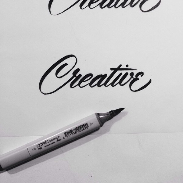
I have ordered another set of coloured Tombow brushpens but I think I also want to get a Copic Sketch brush marker because they seem to be firmer, so I can try out more mid-century style lettering such as this: 


https://www.behance.net/gallery/Brush-Lettering-Collection-No-1/14266643?