Sunday, 22 March 2015

OUGD602 - PPP3 - A Design Presence - Personal Branding Logo Update

Last year (Level 5) I created a brand for myself for the PPP2 module. At that time I was very much into mid-century, quirky, child-like design and whilst it is still my favourite style to work in, I now feel like it looks rather juvenile and not very... professional. 


I like the colours... the shapes, the lettering even but I think that it needs toning down a bit to not only be more legible but more professional and appeal to a wider audience.

This year, I feel like the logo isn't a big deal and making it really detailed and well thought out is actually counter-productive as it makes it more stylised, therefore more niche and slims your market down. Plus, like now, in a couple of years you don't like it so much, it becomes dated etc etc. Simpler the better! 

It's so difficult creating a logo for yourself, so I've decided to look around at my favourite designers and see what they're personal brand is:

Of course Jessica Hische had to be included:

Martina Flor:

Wrenhouse Design:

JoraVision:

MinaLima:

The main thing I'm seeing in the first three logos is a simply styled script typeface with a handmade feel. 

I think I'm probably going to go for something like that.

On my book cover design for Penguin Random House, I drew my name with the Bamboo Graphics tablet in my own handwriting to sign the design:

I think I'm just going to play around with this - can't get a more personal typeface!

I like the idea of a circle but Mel Gater advised me that a circle is a difficult shape to be able to apply to an array of items, and that it would be more useful to have something not quite so 'closed'
So this shape is out then!

To be honest, I just like the simplicity of my name all on one line. I also added a wonky rectangle around it to give it that mid-century touch to go with the rest of the designs.


It also works well in inverse!


Well, there you have it, it was easier than I thought. I think I may possibly use my name both with and without the box around it, depending on what is needed. I like it a lot! I used it in my PPP presentation.

Saturday, 21 March 2015

OUGD602 - PPP3 - Inspiration and Development - Drawing tablet

Recently, I have been revisiting my old Bamboo Drawing tablet, which I received for my birthday about 4 years ago, before I even came to university. I had never really got into it, because my direction was always with design, and I didn't get the hang of drawing digitally, as I think I was pushing for results similar to that of real pencils and pens and was frustrated when I wasn't achieving results... But recently, I have been watching a lot of online lectures on Skillshare and after the Creative Networks event back in November and seeing Babs Tarr's amazing work, it really inspired me to give it a go again. 

I can feel my heart tug my career in a different direction and I'm coming to the realisation that I have always favoured more illustrative work over more type based work under the Graphic Design umbrella, and in retrospect I might have been better suited to the BA Hons Illustration course. But I also believe that everything happens for a reason, and the Illustration course didn't exist when I decided to pursue Graphic Design at Leeds College of Art... And so now, as I am nearing the end of my time on the course I think it's wise to broaden my skillset and in addition to my illustrative skills concerning hand drawn type, and more graphic-design based skills, I want to develop some basic skills with digital painting. I think this is very useful if I want to pursue a career in the Themed Entertainment industry as that concerns a lot of concept art.

Examples of how concept art informs the Themed Entertainment industry as a Graphic Designer:


http://melodymatheny.com/


http://www.wrenhouse-design.com/#!universal-creative/cm4j


http://www.minalima.com/film-work/prop-design/prop-concepts-harry-potter-2


I attempted a go at this over Christmas when I was developing ideas for my Context of Practice module however this time I am revisiting with a bit more ideas as to what I can achieve.

I found that studying Babs' work not only gave me inspiration, but some pointers as to how to go about mastering the drawing tablet as a medium. I also watched a few of these tutorials on youtube:


I found these tutorials really helpful, particularly the landscape tutorial as it taught me that the main thing with drawing on the graphics tablet is the ability to layer up the different strokes, even utilising the different layers in Photoshop to create a solid, dense effect.

I decided to draw something I knew how to draw and that I doodle often - a human eye:


It's not brilliant or by any means a finished piece, but it taught me quite a lot about the tablet. It's based off my own eye as reference, I was using a mirror. I decided to have a go at some more facial features as practice for shadow and light.


Then I decided to join it to a mouth:


And then into a full face:


It strangely bares resemblance to my own face in a creepy, starey way. I decided to call it a night, but this is definitely the start of a new skillset that I wish to develop and add to my portfolio - I need to develop these skills further.


Thursday, 19 March 2015

OUGD602 - PPP3 - Inspiration - Tombow Brush Pen

Today, I received my Amazon order of a Tombow ABT brush pen. After working on this collaboration with Roxxie Blackham and using her brush pens, I was impressed of how it helped achieve script writing effects, as I had always used a pencil (probably obvious but anyway). 

After watching this video on youtube ...


(excuse the language) I decided that a Tombow ABT brush pen was my best bet:


Here's a few of my first doodles:


I mean, these are all pretty naff by any means, but I really want to develop this as a skill, as it can assist with hand lettering with type as image. I am going to keep developing this whenever I get time - most definitely in summer after I have completed my degree (!).


An example of brush lettering in Graphic Design.
http://www.itsnicethat.com/articles/cardon-webb-ralph-ellison-covers


The versatility of producing lettering by hand means that the logo/ design/ title is unique for the client.
https://www.behance.net/gallery/Brushpen-Lettering-set-02/8309133

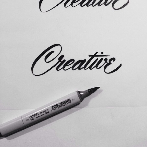
I have ordered another set of coloured Tombow brushpens but I think I also want to get a Copic Sketch brush marker because they seem to be firmer, so I can try out more mid-century style lettering such as this: 


https://www.behance.net/gallery/Brush-Lettering-Collection-No-1/14266643?

Monday, 2 March 2015

OUGD602 - PPP3 - A design presence/ Personal Branding - Updated CV and Covering Letter

As outlined in the previous post I've made today for applying for Disney (again) I just wanted to show how I've updated my CV and covering letter since, well the last time I used it - when I applied for Disney International programs in summer 2013.

Here is my old CV and covering letter;


This is not the last one I designed, but the last one I used! I designed it in the summer of 2013 during my last online application. Looking at it now it's just awful, but I can see that I wanted to stand out, I imagined a big pile of CV's and wondered how to make mine the most garish, I guess.

I then designed this one last year: - 


But never got around to using it. I like what I designed but looking at it it still looks rather juvenile, again, in an attempt to create something a bit different and again - garish! I like the colours and nod toward mid-century style but I think it narrows my audience a bit too much and it needed to be made more simple.

Here is the CV I designed/ used most recently for my applications at Disney Pro Interns:


I borrowed elements of the mid century style used in my last CV but the format just wasn't practical, plus I think that this simplified version is more modern and better suited for it's purpose.


OUGD602 - PPP3 - Applying for an MFA Continued & Applying at Walt Disney Pro Interns

Back in November, I was exploring all the many options to take upon departing the course in May/ June, and as you can see in this post here, one of the routes I investigated was the idea of becoming a US student on a MFA course studying Themed Entertainment Design. When I came into contact with professionals in the industry whilst over there in the 'States, it became apparent that it would be more straightforward to be involved in internships at Walt Disney Pro Interns as a US student, as that's what most people assumed I was and when I corrected them, I got the impression that my entry into the company as a professional would not be so sure.

My last word on this blog about the topic is that I would have to investigate the possiblity of deferring my application to 'fall' of 2016, because it would give me a year in industry to not only raise funds, but to further my portfolio and industry knowledge whilst having a break from education. But now, I'm not so sure that this route is entirely necessary (many others have made it into the industry without acquiring this MFA degree at all) and have cancelled my application altogether for the time being. 
Sometime in years to come I may apply again, but whilst 

  • the course is still in it's infancy
  • i'm hungry to get out in the working world with a break from education
  • I'm not quite ready to move over to the 'States on a more permanent basis
  • My funds aren't satisfactory for this kind of move

...I think it's best to postpone this idea for another time in my life.

Having said all of this with my sensible brain on, I'm still longing for this fast-paced, dream career in the US in the Themed Entertainment industry, and have applied to a series of internships on Disney's 'Pro Interns' program:


As you can see, the site is aimed at 'students and recent grads' so I jumped at the chance to apply. I felt like I would have quite a good chance at it because of having worked there last summer. (then again, it is a humongous company...)

I applied to 4 different internships (the Disney J1 Cultural Exchange Program is my International College Program I did last summer):


The first I applied to was an internship at Disney's Yellow Shoes. DYS is responsible for all of the marketing for the Disney Parks - I really love their work cos it's so playful and magical, not just like regular advertising (obviously it's amazing, it's Disney!) I first saw their work in 2nd Year when we were studying web design and came across their website for promoting the New Fantasyland section of the Magic Kingdom in Walt Disney World Resort in Florida:


As you can see, it's experience based design that leans more toward the Themed Entertainment Industry rather than marketing or advertising. 

I was also drawn to it because it asks for a Graphic Designers' role, which I will obviously be qualified in upon arrival.

The 'role' description is as follows:

Yellow Shoes Assoc Interactive Art Director/Design Intern, FL- Fall 
Segment Overview: Since its opening in 1971, the Walt Disney World Resort near Orlando, FL has grown to feature four theme parks – the Magic Kingdom Park, Epcot Disney’s Hollywood Studios, and Disney’s Animal Kingdom Theme Park. In addition, more than 20 themed resort hotels, two water parks, and the Downtown Disney Area, a daytime and nighttime entertainment complex, are part of the Walt Disney World Resort.

Department Overview: Do you live for the Big Idea? Do you know how to make something emotional that people will want to connect with? Do you geek out about typography and design? If so, we’d love to hear from you! We’re Disney Yellow Shoes, the award-winning, in-house creative shop for Disney Destinations. Every day, we have fun creating compelling, memorable work for one of the greatest brands on the planet, and we’re looking for one very talented Art Director/Graphic Design Intern to join us. For an example of one of our recent projects please visit www.findingfantasyland.com

Obviously, it says 'interactive' which means it will concern more digital design. Even though I've worked with mostly print-based design in the past, I've jumped on this with both feet as I know I'll be working in a team and that I'm also interested to learn digital design and animation - you can do a lot more to create an experience for the user if it's digital or interactive!


I also applied to a very-similar-but-not-the-same position at DYS but not interactive or digital.


I applied to another Role opening in the Creative Entertainment Department, which is amazing too (I'm torn!) because it concerns things created for actually inside of the park, which is really where I dream to be, if I'm honest. 

the role description is as follows:

Creative Entertainment Art Design Internship, FL/CA – Fall 2015

Segment Overview: The Disney Theme Parks and Resorts are not just home to Disney’s beloved characters but are also the place “Where Dreams Come True.” The Walt Disney Parks and Resorts segment traces its roots to 1952, when Walt Disney formed what is today known as Walt Disney Imagineering to build Disneyland Park in Anaheim, California. Since then, Walt Disney Parks and Resorts has grown to encompass Disney Cruise Line, Disney Vacation Club, and Adventures by Disney, and five resort locations (encompassing 11 theme parks) on three continents.

Department Overview: Walt Disney Parks & Resorts Creative Entertainment is a dynamic entertainment environment, offering nothing less than the perfect show for millions of guests worldwide. An integral part of this organization is the Show Development & Production Design department that is responsible for the development of designs/scenic treatments/logos/graphics for live shows including parades, stage shows and special events on and off the Disney property and onboard the Disney Cruise Line.

How exciting is that! As I interpret this description, it says to me that I would be producing Graphic Design for the ever-evolving shows, parades and special events in all of the parks. It is almost the same as creating designs for the rides themselves, as you know is my ultimate career dream! 


My final application is the one I'm longing for the most as it is at Walt Disney Imagineering - the team responsible for all of the Graphics and signage for the rides, shows, environmental designs WITHIN THE PARKS. Dream job alert!!

Here is the role description:

Graphic Design Internship, Orlando, Summer 2015

Segment Overview: Walt Disney Imagineering is the master planning, creative development, design, engineering, production, project management, and research and development arm of The Walt Disney Company. Its talented corps of Imagineers is responsible for the creation - from concept initiation through installation - of all Disney Resorts, theme parks and attractions, real estate developments, regional entertainment venues, and new media projects. Imagineering is headquartered in Glendale, California, with affiliated offices and facilities in North Hollywood, California and Celebration, Florida; as well as satellite branches at every Disney Theme Park location around the world.

Department Overview: This department is the Environmental Graphic Design team within Walt Disney Imagineering that develops signage and show graphics to help tell the stories throughout the Walt Disney World Resort.

To me, this is a once-in-a-lifetime opportunity that I should take whilst I am still a student and is available to me in the position I am in. As of today, 2nd March 2015, three out of the four applications are 'in progress' which I am delighted about. I'm so excited cos if I'm accepted it should blend seamlessly at the end of my course at Leeds. It would be the cherry on top of a fantastic three years and a springboard into the rest of my life in my dream job!